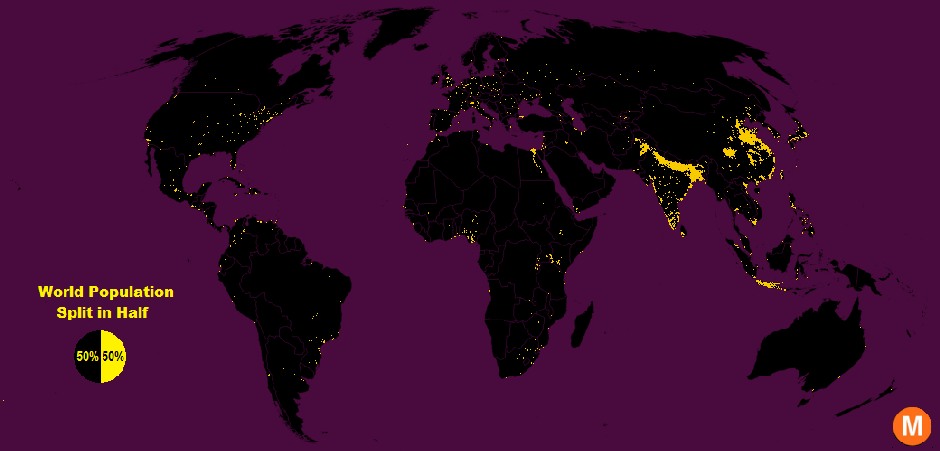
In the simple map above lies a stark spatial imbalance: half the people in the world cram into just 1 percent of the Earth’s surface (in yellow), and the other half sprawl across the remaining 99 percent (in black).
Data viz extraordinaire Max Galka created this map using NASA’s gridded population data, which counts the global population within each nine-square-mile patch of Earth, instead of within each each district, state, or country border. Out of the 28 million total cells, the ones with a population over 8,000 are colored in yellow. That means each yellow cell has a population density of about 900 people per square mile—“roughly the same population density as the state of Massachusetts,” Galka writes in the accompanying blog post. The black regions, meanwhile, reflect sparser population clusters.
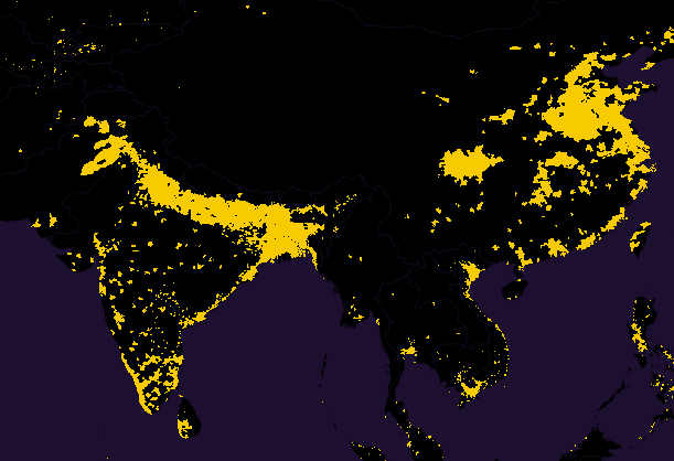
Take this close-up of South and East Asia. The region in this image alone contains about 46 percent of the world’s population, which isn’t all that surprising considering India and China are the two most populous countries in the world.
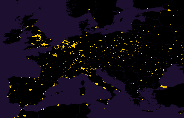
Asia’s densest spots are mostly concentrated in the inland urban areas. Europe, on the other hand, is nowhere as dense as Asia but has its population hotspots sprinkled more uniformly across its area:
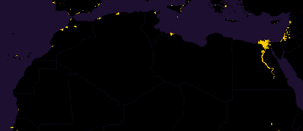
North Africa is almost entirely dark except for Cairo, which contains the yellow cell with the largest population in the world—a million people within the nine-square-mile sliver of land:
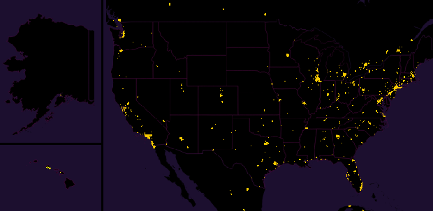
A lot of the population clusters in the U.S., as the close-up of the map below shows, are located in many Northeastern, Southern, and Western cities. Overall, the U.S. mirrors the world in the way its population is divided: one half packed in the small yellow regions, the other half spread out across a black expanse.

No comments:
Post a Comment