Visitors

Sunday, December 27, 2015

Massive Alaska storm tied an all-time intensity record

Original post by: Andrew Freedman Mashable December 15 2015


A gargantuan, monster storm developed off the southwest coast of Alaska from Dec. 12-14, lashing the outermost Aleutian islands with winds equivalent to a Category 3 hurricane, and producing towering waves capable of sinking large ships.
The storm, which maxed out at an intensity of about 924 millibars, in terms of its minimum central air pressure, likely tied the record for the strongest North Pacific non-tropical storm (in general, the lower the pressure the stronger the storm). According to meteorologist Jeff Halverson, writing for the Capital Weather Gang blog, this low pressure reading tied the record for the lowest wintertime pressure in the North Pacific Ocean since such records began in the winter of 1969-1970.


The previous strongest storm in this region occurred last year.

The storm resulted in an astonishingly strong wind gust to 122 miles per hour at Adak Island, Alaska, and had a large swath of hurricane-force winds. The strongest winds were associated with what's known as a "sting jet" that comes in on the backside of such a storm, enhancing winds near the surface. Scientists have only identified this feature of powerful low pressure systems in recent years.


The storm is influencing the weather across Alaska as it weakens but continues to spin off the coast. It will also help to initiate a southward movement of cooler air from northwest Canada into the northwest U.S. during the next week.

Friday, December 18, 2015

MAPS OF THE EARTH'S MOST CURSED DESTINATIONS


Original Post:  TAO TAO HOLMES Atlas Obscura
14 DEC 2015


Amityville, New York: One of the world's cursed places. (All images: Courtesy Atlas of Cursed Places: A Travel Guide to Dangerous and Frightful Destinations)

Curses are not all the same. Take it from journalist and sailor Olivier Le Carrer, who has explored 30 of the 40 perilous places charted in his new book—and lived to tell their tales.

Atlas of Cursed Places: A Travel Guide to Dangerous and Frightful Destinations is a beautifully bound volume with detailed maps in classic pastel tones, filled with stories of underground infernos, spiritual nightmares, hunted pirates, and killer crocodiles.

The book, organized into eight geographical regions, chronicles sites across the globe that have been afflicted by a miscellany of misfortunes. Le Carrer explains that there are three major types of curses: those of a mystical order, those dealing with the preternatural, and, perhaps most tragically, those of places rendered uninhabitable by human activity. They’re all bound together by one common denominator: the terrible luck of all concerned.

In the book’s introduction, titled “The Hazards of Traveling,” Le Carrer states that since the time of the Old Testament, “humanity has found more effective ways of damning itself… devising an almost infinite number of hells that no god or demon would ever have dared to contemplate back in the day.”

Le Carrer’s work is aimed at those who believe the world is still full of mysteries to investigate. We may have assigned every point on our planet a latitude and a longitude, but those can hardly explain the hundreds of aircraft that have disappeared in the Nevada Triangle or why so many people choose to commit suicide in Japan’s Aokigahara Forest.

Below, a cartographic glimpse at a few locales featured in the Atlas of Cursed Places.


Château de Montégur: Satan's Synagogue

Ah, the south of France—home to medieval towns, romantic seaside villages, and “Satan’s synagogue,” an ancient castle perched atop a high, rocky precipice. In the 13th century, the castle was the site of a pyre built for pacifists of the Cathar faith, while several hundred years later, German researchers under the Nazi regime came to investigate their belief that the Holy Grail was hidden somewhere within. The building’s architecture and floor plan also raise the possibilities of greater mysteries at work. Whatever the case might be, the legends keep curious visitors coming.


Oumaradi: Shipwrecked By Sands

The Harmattan is a wicked wind that blows across West Africa’s Sahel belt all winter long. For some reason, its nickname is the “doctor.” The wind blows the desert sand into massive dunes that, over time, can swallow entire villages. Oumaradi is one of many villages in Niger at risk of being entirely consumed by sand sent by the doctor. It becomes hard to breathe, and hard to survive.


Poveglia: The Island of Death

No book of curses is complete without some invisible, tormented, wandering souls. And who isn’t intrigued by the words “island of death”? Poveglia, located just off the coast in northern Italy, seems innocuous, even pleasant, when viewed from afar. But 160,000 bodies are believed to be buried on the island's few acres, now covered in the collapsed and overgrown buildings that formerly housed lepers and plague sufferers. While local records neither confirm nor deny the legend, this island's restless souls are still thought to wield power over the living, and Poveglia remains carefully abandoned.


Charybdis and Scylla: A High-Risk Cruise

This is no Caribbean Carnival Cruise. This cruise—through Italy's Strait ofMessina—could end up involving Scylla the sea monster or Charybdis, Poseidon’s exiled daughter who churns the sea into angry whirlpools. Mariners of yore were careful when navigating these Mediterranean waters caught between the Tyrrhenian and Ionian seas, but these days, ferries take regular trips across the strait. None, so far, have been caught in one of Charybdis’ desperate whirlpools–but one should never speak too soon.


Gaza: A Territory Adrift

Gaza—how much do you actually know about the place? Before it fell to pieces, Gaza was home to beautiful buildings and great prosperity. Everyone knew about Gaza, though back then, it was for different reasons. Formerly a trade hub for the Egyptians, then Philistines, then Assyrians, Babylonians, Persians, Greeks, and finally Romans, its prime location as both a land and sea crossroads has forever been the region’s blessing and curse. Gaza saw churches and monasteries, then mosques caught in the center of conflict, and the curse of conflict defines Gaza today, now named Gaza City, or the Gaza Strip and one of the world’s most densely populated and poorly governed places. Water and food are increasingly scarce resources, though regional tensions continue to be found in abundance.


Gur-Emir: The Malevolent Mausoleum

The site of this cursed edifice lies in modern-day Uzbekistan in a region formerly known as Transoxiana. Timur, ruler of the region in the 14th century, went around and slayed everyone in his kingdom who he felt served him no purpose—a total of 17 million apparently purposeless citizens. Timur commissioned this mausoleum for his grandson, who was killed in combat, with the intention of joining later on. While the mausoleum is elegant and impressive in its grandeur, don't forget that the man behind it sent 17 million people to their very arbitrary deaths. Skipping ahead a whole bunch of centuries: On June 22, 1941, a few hours after a Russian forensic scientist opened the tomb to exhume and study Timur’s remains, Germany launched an attack on the Soviet Union. Curse or coincidence? You decide.


Thilafushi: The Toxic Lagoon

The Eden-esque beauty of the Maldives has now been luring in tourists for decades. Yet as the population balloons and tourists continue flocking, the isolation and tiny size of the many scattered islands of the country’s 26 atolls are posing logistical and environmental nightmares. In 1992, to address the issues, authorities came up with an idea of a communal garbage dump, located on Thilafushi, an island lagoon a few miles away from the capital of Malé. Little did they recognize that while Thilafushi is a mere 650 feet wide, one person produces multiple pounds of waste each day. The island-dump has been steadily growing as more and more junk is thrown in its general vicinity, while rafts of trash break off and float aimlessly into the ocean. Compounding the curse? Rising sea levels.


Amityville: The Devil's Lair

Even if you haven’t visited the house at 112 Ocean Avenue, you probably recognize the name Amityville from the title of the 2005 horror film, based on the 1977 book. It's a house in Amityville, New York, that comes with some baggage; legendarily built on a Native American burial ground, in 1974 it was the site of a son’s terrifying murder of his parents and four siblings. The son afterward claimed that the house had told him to commit the killings. When new inhabitants moved in just a year later, they too heard voices, and had moved out within the month. Since then, there have been no other complaints of the supernatural, but thousands of curious onlookers still come to visit the house of horrors.

Map Monday highlights interesting and unusual cartographic pursuits from around the world and through time. Read more Map Monday posts.

Thursday, December 17, 2015

From Drip to Glide: How Plate Tectonics Started


Original post by Becky Oskin, Senior Writer
livescience
Date: 06 April 2014 Time: 01:00 PM ET


Tectonic plates of the Earth.
CREDIT: USGS

A cold, crusty shell of a planet that regularly kills off its occupants with violent earthquakes and massive volcanic eruptions doesn't sound like ideal habitat. But Earth's grinding plates, the source of its deadly tectonics, are actually one of the key ingredients that make it only planet with life in the solar system (found so far).

Now, a new model seeks to explain why Earth's plate tectonics is unique among the sun's rocky planets. It all comes down to tiny minerals in rocks.

"What goes on in rocks has helped us understand how plate boundaries evolve," said David Bercovici, a geophysicist at Yale University and lead author of the new study.

Plate tectonics is a widely-accepted theory that says the Earth's outer surface, or crust, in divided into rigid plates. These plates move around the planet on top of convection currents in the mantle, the hotter rock layer between the crust and Earth's core. The crust is recycled back into the mantle at subduction zones, where one plate bends down under another. [Related: What is Plate Tectonics?]

There are hints that the plates emerged 4 billion years ago, only 500 million years after Earth formed. But many researchers think the full system of plate tectonics we see today — with the entire Earth's surface covered in rigid plates that crash, slide and subduct — didn't really get set up until about 3 billion years ago. For example, instead of subduction zones, pieces of crust "dripped" into the mantle like a sinking blob in a lava lamp, some researchers think.
Bercovici and co-author Yanick Ricard, of the University of Lyon in France, set out to solve the billion-year gap. Their model builds on experimental evidence of how the minerals within rocks behave at certain temperatures and pressures, as well as geologic evidence, such as rocks called mylonite, brought from deep in the Earth to the surface through movement along faults. The study was published today (April 6) in the journal Nature.

Starting at the microscopic level with minerals, or grains, in rocks, the researchers investigated how rocks weaken when they are damaged. Bercovici and Ricard discovered a feedback loop. First, mineral grains get smaller when rocks grow weaker. Then, in the researchers' model, flowing zones of rock deformation tend to hone in on the weak rocks, and add to the damage of the minerals — which made the grains grow even smaller, even faster.

"Because of the feedback, a deformed zone gets narrower and more focused, and ends up looking like a plate boundary," Bercovici told Live Science's Our Amazing Planet.

On the early Earth, the first weak zones were proto-subduction zones, where blobs of crust dripped down into the mantle, the researchers suggest. Here, rocks were deformed and mineral grains grew smaller, according to the model. Over a billion years, these weak zones grew and connected into actual plate boundaries, the researchers showed.

"They're like scars," Bercovici said. "Eventually you get enough of them to form a contiguous plate boundary."

The researchers also compared their Earth plate tectonics model to Venus, finding that the surface of Venus was too hot for plate tectonics to develop. "Because it's hotter, the damage heals faster and the [rock] grains grow strong again," Bercovici said.

Email Becky Oskin or follow her @beckyoskin. Follow us @OAPlanet, Facebook and Google+. Original article at Live Science's Our Amazing Planet.

Tuesday, December 15, 2015

Mapping 65 Years of Explosive Urban Growth

This delightfully user-friendly data viz tracks city population trajectories.


Duncan Smith


In 1950, only 30 percent of the world’s population lived in cities, compared with 54 percent in 2015. A new map by urban geographer Duncan Smith tracks the bursts in city populations that contributed to this growth.
Here’s Smith on the implication of global urbanization patterns, in a guide to his interactive data viz:  
Our increasingly urban world now frames many of society’s greatest challenges. From global equality to health, education, prosperity and, not least, sustainability, solutions need to be interwoven with fostering livable, efficient and inclusive cities.
In its 2014 World Urbanization Prospects report, the UN tracked the populations of major cities from 1950 to 2014, then predicted how these populations would grow (or shrink) up to the year 2030. Using these data, Smith represented each city on his map with a dark blue core, the size of which is proportional to the city’s 1950 population. The concentric circles around that core, in lighter blue, vary according to the city’s population in 1990, 2015, and 2030.
The result is a delightfully user-friendly map of urban trajectories. Take the London chart below. The city housed around 8.4 million residents in 1950, but in the second half of the 20th century its population fell, in line with many other major metros of Western Europe and the Northeast U.S. It’s now creeping back up but remains far outpaced by growth in other cities. In 2030, it’s expected to be the world’s 36th biggest city, whereas in 1950 it ranked third.
Much urban growth in the 21st century has been driven by Asia, which now houses 53 percent of the world’s urban population. In China, one area of startling growth is the Pearl River Delta, which comprises several large, and rapidly expanding cities such as Hong Kong, Guangzhou, Shenzhen, Foshan, and Dongguan. Clumped together, these cities make Pearl River Delta the world’s largest urban area in size and population:


In the years to come, India will contribute more urban growth than any other single country, the UN predicts. For the last 65 years, its capital of New Delhi has seen massive jumps in population. In the next 15 years, it’s going to gain another 10 million residents, likely reaching a high total of around 36 million. At this rate, it’s on track to one day overtake Tokyo (which is likely shrink to 37 million by then) as the world’s largest individual city:


Monday, December 14, 2015

This World Map Shows Which Cities Have The Most Smog, In Real Time

Original post: Adele Peters for co.EXIST

A new map updates with current pollution levels in cities around the world. First stop, Beijing.


On a new world map of smog, a giant dark bubble hovers over Beijing. The city, now in the middle of its first-ever emergency "red alert" for air pollution, has closed schools and temporarily taken cars off the road as smog keeps getting worse.

But scrolling around the map—which updates pollution levels in real time—it's quickly obvious that Beijing isn't the only place with a problem. While cities with blue bubbles have clean air, the darker the bubble gets, the more polluted it is.

In New Delhi on Monday, the air quality index made it up to 377 (Beijing was 253). In the U.S., the EPA considers any measurement over 200 very unhealthy, and over 300 hazardous. On the map, a gray cloud hangs over a big chunk of China, and several other cities in India fall into the "extreme pollution" category. If you click on other cities, like New York, the pollution levels are high enough that the site recommends taking it easy with exercise outside.


The map, from a startup called Plume, uses open data from air quality monitors in 40 countries around the globe. The company already had apps (iOS, Android) designed for specific cities, which you can use to see when might be the safest time to go for a run or take your baby to the park. But they wanted to lay out all of their data in a single visualization, unveiled for the international climate talks in Paris taking place this week.

"Air pollution is a major environmental health issue all around the world," says Romain Lacombe, CEO and founder of the Paris-based Plume Labs. "We wanted to show that it’s an issue we all face—and must work together to solve. The world air map does just this: it reveals the invisible by visualizing the pollution in the air we breathe, live and all around the world, rather than city by city."


In cities where air pollution isn't tracked or data isn't publicly available, the startup uses large-scale simulation models to estimate pollutants from meteorological research and how that pollution might move. In the cities that have open data, the app tries to predict how smog levels will change throughout the day based on past patterns.

He's hoping the global map can serve as a reminder that carbon emissions are already a problem. Every year, 7 million people die because of air pollution. "Our aim with this map is to visualize the global pandemic of air pollution in order to raise awareness of the importance of clean air for our health," says Lacombe. "Air pollution is the first symptom of climate change."


[All Photos: Plume]

Sunday, December 13, 2015

27 Maps That Will Teach You Something About the World


BY MATT HERSHBERGER

THIS PAST MONTH, YOU MAY HAVE experienced a moment, while walking through a mall or driving in your car, when you thought, “Is there anyone on the planet who isn’t listening to Adele right now?” The answer was actually probably closer to zero than you’d think: iTunes is available in most of the world’s countries, but only 4 didn’t have “Hello” as the number one song in the month of November.

Each month, we put together some of the coolest maps on the internet. This month, we found maps that show us which states can expect to have a White Christmas, which countries have the highest numbers of atheists, which Europeans wash their hands the most thoroughly, and which countries ISIS thinks belong to the “coalition of devils.” And, of course, a map on which countries continue to deny the genius of Adele.


1

U.S. state birds

The south loves its mockingbirds. Larger version available here. Via Reddit

2

Wine vs. beer

What do Americans Tweet about more? Wine or beer? Via Reddit

3


4

The currencies of the world's countries

What countries call their currencies. Via Reddit.

5

Who's reasonably dreaming of a white Christmas

Okay, so you're dreaming of a white Christmas. But how likely is that to happen? Via Reddit.

6

The world with Cuba at the center

Most maps show the UK at the center of the world. What if they showed Cuba instead? Via Reddit

7

Where physician-assisted suicides are legal

"Death with dignity" is slowly spreading. Via Reddit.

8

Which Europeans wash their hands with soap the most


9

Where the impact of terrorism is the worst

From the report this is based on: "The Global Terrorism Index (GTI) is a comprehensive study which accounts for the direct and indirect impact of terrorism in 162 countries in terms of its effect on lives lost, injuries, property damage and the psychological aftereffects of terrorism." Larger version here. Via Reddit.


10

Where Adele's Hello was number one on iTunes

Niger, Burkina Faso, Papua New Guinea, and Kyrgyzstan were not quite as psyched about Adele as the rest of us. Via Reddit

11

Where 30% tree cover exists.

The U.S. east coast has managed to stay pretty well forested, despite its population density. Via NASA

12

The most televised NFL teams by region

Poor Raiders fans. Via Reddit

13

Countries by number of statues over 30 meters

Who has the most tall statues? Via Reddit

14

The happiest countries

We should note that when polls are "self-reported," there might be a lot of people lying. Via Reddit.

15

Old rocks of North America

A larger map is available here, but in short, the redder/purpler the map is, the older the rocks. Via Wikimedia


16

Countries that most agree with the statement, "People should be able to say offensive things to minorities publicly"

It's either a measure of freedom of speech, or of bigotry, depending on how you look at it. Via Reddit

17

Where the convinced atheists are

"Convinced," incidentally, is not the same as being non-practicing or just generally irreligious. Via Reddit

18

The world at war

Note: some of these countries have armed conflicts, but only in a small section of the country. Larger map here. Via Reddit.

19

Where farmland will migrate by 2100

A slight clarification: the "Areas no longer farmable" is slightly misleading, as these areas may still be farmable, but will be less agriculture-friendly. Via Reddit.

20

The legality of cannibis worldwide

The slow spread of legalized cannabis. Via Reddit

21

The deadliest earthquakes since 2150

Note: the title within the picture isn't totally accurate: earthquake intensity and their death tolls are not necessarily the same. But the information is still interesting. Via Reddit.

22

The "coalition of devils"

The "coalition of devils" according to ISIS. Via Reddit

23

Countries with the most German speakers

Where has the German diaspora spread most to? Via Reddit

24

Number of venomous species by country

Which countries have the most poisonous animals? Via Reddit

25

Prison populations of the world per 100,000 people

Wait for the joke to land. Wait for it... Via Reddit

26

Secessionist movements in Africa

Which African countries have active secessionist movements? Via Reddit

27

Sharks vs. Humans

In the war between sharks and humans, who is winning? Via Reddit

h/t: the MapPorn Subreddit.

Friday, December 11, 2015

Map of World's Groundwater Shows Planet's 'Hidden' Reservoirs

Original post by:
Elizabeth Newbern, Staff Writer | December 03, 2015 07:21am ET
livescience


A map that shows the distribution of modern groundwater around the world and how deep these resources would be if pooled above ground.
Credit: Karyn Ho

A new map of Earth's groundwater supply shows where on the planet water is locked up and "hidden" underground.

The map — the first of its kind — provides a visual representation of Earth's groundwater resources and estimates that the planet's total groundwater supply stands at approximately 5.5 million cubic miles (about 23 million cubic kilometers).

Groundwater is the source of the world's second-largest collection of freshwater, according to the National Ground Water Association. (The planet's primary source of fresh water comes from glaciers and ice caps.) Groundwater is collected from rainfall that seeps underground into aquifers and reservoirs beneath the land surface, according to the U.S. Environmental Protection Agency (EPA).

Groundwater is important for energy and food security, human health and healthy ecosystems, but it's also a resource that is at risk from overuse and human pollution, researchers said in a new study published online Nov. 16 in the journal Nature Geoscience.

The scientists obtained measurements of tritium, a radioactive version of the hydrogen molecule, and water flow models that used properties of water and its interaction with different types of rock to estimate how much groundwater the world possesses, where it is distributed and the age of the water in these underground reservoirs.

The researchers calculated that of the 5.5 million cubic miles of total groundwater in the uppermost 1.2 miles (2 km) of the continental crust, only between 24,000 to 129,500 cubic miles (100,000 to 540,000 cubic km) is young (modern) groundwater, which is less than 100 years old.

But, why is it important to know the age of groundwater? It turns out that young and old groundwater are fundamentally different in how they interact with the rest of the water and climate cycle, according to the study.

Old groundwater (more than 100 years old) is found at greater depths and sometimes contains arsenic or uranium. This water can also be saltier than ocean water. While some of it is used in agriculture and industry, much of it is so old and stagnant that it is no longer a part of the active water cycle, which means most of it isn't usable by humans, Tom Gleeson, lead author of the study and an engineer at the University of Victoria in Canada, said in a statement.

In contrast, modern groundwater (less than 100 years old) is still a part of the active water cycle, which means it has the capacity to renew itself through rainfall or melting snow However, modern groundwater (which is where we get the largest portion of drinking water) is closer to water we see on the Earth's surface, such as oceans, lakes and rivers. Because this water is close to the surface, it often helps replenish large bodies of water when they deplete through the year. However, because climate change has impacted the amount of rain and snow in certain regions, some groundwater reservoirs are not being refilled as fast as they used to. Human activities are also making it harder for groundwater to replenish quickly, and pollution is causing some of the water in these underground aquifers to become unusable, according to the study.

The maps that were developed from the study show that most modern groundwater is found in tropical and mountainous regions. Some of the largest reservoirs can be found in the Amazon basin, the Congo, Indonesia, the Rocky Mountain regions of North and Central America, and the Western Cordillera of South America.

Unsurprisingly, the maps show that arid regions, such as the Sahara desert, have the least amount of modern groundwater. The researchers did note that high northern latitudes were excluded from the data because of inaccurate satellite measurements, but they think that because the region is covered in permafrost, which doesn’t allow for much groundwater storage, it won't significantly affect the estimates of total groundwater.

With growing global demand for water, the new study could have important implications for water managers, policy developers and scientists who may need to better manage groundwater resources in a sustainable way, Gleeson said. "Since we now know how much groundwater is being depleted and how much there is, we will be able to estimate how long [it will be] we run out," he said.

Follow Elizabeth Newbern @liznewbern. Follow Live Science@livescience, Facebook & Google+. Original article on Live Science.

Thursday, December 10, 2015

Marie Tharp: Mapping the Ocean Floor


Original post by:  Brooke Jarvis
Friday, December 4, 2015 at 5:00 AM


Without ever setting sail, Marie Tharp mapped the ocean floor and made a discovery that shook the foundations of geology. So why did the giants of her field dismiss her findings as "girl talk"?


Marie Tharp spent the fall of 1952 hunched over a drafting table, surrounded by charts, graphs, and jars of India ink. Nearby, spread across several additional tables, lay her project—the largest and most detailed map ever produced of a part of the world no one had ever seen.

For centuries, scientists had believed that the ocean floor was basically flat and featureless—it was too far beyond reach to know otherwise. But the advent of sonar had changed everything. For the first time, ships could “sound out” the precise depths of the ocean below them. For five years, Tharp’s colleagues at Columbia University had been crisscrossing the Atlantic, recording its depths. Women weren’t allowed on these research trips—the lab director considered them bad luck at sea—so Tharp wasn’t on board. Instead, she stayed in the lab, meticulously checking and plotting the ships’ raw findings, a mass of data so large it was printed on a 5,000-foot scroll. As she charted the measurements by hand on sheets of white linen, the floor of the ocean slowly took shape before her.

Tharp spent weeks creating a series of six parallel profiles of the Atlantic floor stretching from east to west. Her drawings showed—for the first time—exactly where the continental shelf began to rise out of the abyssal plain and where a large mountain range jutted from the ocean floor. That range had been a shock when it was discovered in the 1870s by an expedition testing routes for transatlantic telegraph cables, and it had remained the subject of speculation since; Tharp’s charting revealed its length and detail.

Her maps also showed something else—something no one expected. Repeating in each was “a deep notch near the crest of the ridge,” a V-shaped gap that seemed to run the entire length of the mountain range. Tharp stared at it. It had to be a mistake.

She crunched and re-crunched the numbers for weeks on end, double- and triple-checking her data. As she did, she became more convinced that the impossible was true: She was looking at evidence of a rift valley, a place where magma emerged from inside the earth, forming new crust and thrusting the land apart. If her calculations were right, the geosciences would never be the same.

A few decades before, a German geologist named Alfred Wegener had put forward the radical theory that the continents of the earth had once been connected and had drifted apart. In 1926, at a gathering of the American Association of Petroleum Geologists, the scientists in attendance rejected Wegener’s theory and mocked its maker. No force on Earth was thought powerful enough to move continents. “The dream of a great poet,” opined the director of the Geological Survey of France: “One tries to embrace it, and finds that he has in his arms a little vapor or smoke.” Later, the president of the American Philosophical Society deemed it “utter, damned rot!”


In the 1950s, as Tharp looked down at that tell-tale valley, Wegener’s theory was still considered verboten in the scientific community—even discussing it was tantamount to heresy. Almost all of Tharp’s colleagues, and practically every other scientist in the country, dismissed it; you could get fired for believing in it, she later recalled. But Tharp trusted what she’d seen. Though her job at Columbia was simply to plot and chart measurements, she had more training in geology than most plotters—more, in fact, than some of the men she reported to. Tharp had grown up among rocks. Her father worked for the Bureau of Chemistry and Soils, and as a child, she would accompany him as he collected samples. But she never expected to be a mapmaker or even a scientist. At the time, the fields didn’t welcome women, so her first majors were music and English. After Pearl Harbor, however, universities opened up their departments. At the University of Ohio, she discovered geology and found a mentor who encouraged her to take drafting. Because Tharp was a woman, he told her, fieldwork was out of the question, but drafting experience could help her get a job in an office like the one at Columbia. After graduating from Ohio, she enrolled in a program at the University of Michigan, where, with men off fighting in the war, accelerated geology degrees were offered to women. There, Tharp became particularly fascinated with geomorphology, devouring textbooks on how landscapes form. A rock formation’s structure, composition, and location could tell you all sorts of things if you knew how to look at it.

Studying the crack in the ocean floor, Tharp could see it was too large, too contiguous, to be anything but a rift valley, a place where two masses of land had separated. When she compared it to a rift valley in Africa, she grew more certain. But when she showed Bruce Heezen, her research supervisor (four years her junior), “he groaned and said, ‘It cannot be. It looks too much like continental drift,’” Tharp wrote later. “Bruce initially dismissed my interpretation of the profiles as ‘girl talk.’” With the lab’s reputation on the line, Heezen ordered her to redo the map. Tharp went back to the data and started plotting again from scratch.

Heezen and Tharp were often at odds and prone to heated arguments, but they worked well together nonetheless. He was the avid collector of information; she was the processor comfortable with exploring deep unknowns. As the years went by, they spent more and more time together both in and out of the office. Though their platonic-or-not relationship confused everyone around them, it seemed to work.

In late 1952, as Tharp was replotting the ocean floor, Heezen took on another deep-sea project searching for safe places to plant transatlantic cables. He was creating his own map, which plotted earthquake epicenters in the ocean floor. As his calculations accumulated, he noticed something strange: Most quakes occurred in a nearly continuous line that sliced down the center of the Atlantic. Meanwhile, Tharp had finished her second map—a physiographic diagram giving the ocean floor a 3-D appearance—and sure enough, it showed the rift again. When Heezen and Tharp laid their two maps on top of each other on a light table, both were stunned by how neatly the maps fit. The earthquake line threaded right through Tharp’s valley.

They moved on from the Atlantic and began analyzing data from other oceans and other expeditions, but the pattern kept repeating. They found additional mountain ranges, all seemingly connected and all split by rift valleys; within all of them, they found patterns of earthquakes. “There was but one conclusion,” Tharp wrote. “The mountain range with its central valley was more or less a continuous feature across the face of the earth.” The matter of whether their findings offered evidence of continental drift kept the pair sparring, but there was no denying they had made a monumental discovery: the mid-ocean ridge, a 40,000-mile underwater mountain range that wraps around the globe like the seams on a baseball. It’s the largest single geographical feature on the planet.

In 1957, Heezen took some of the findings public. After he presented on the Mid-Atlantic Ridge at Princeton, one eminent geologist responded, "Young man, you have shaken the foundations of geology!” He meant it as a compliment, but not everyone was so impressed. Tharp later remembered that the reaction “ranged from amazement to skepticism to scorn.” Ocean explorer Jacques Cousteau was one of the doubters. He’d tacked Tharp’s map to a wall in his ship’s mess hall. When he began filming the Atlantic Ocean’s floor for the first time, he was determined to prove Tharp’s theory wrong. But what he ultimately saw in the footage shocked him. As his ship approached the crest of the Mid-Atlantic Ridge, he came upon a deep valley splitting it in half, right where Tharp’s map said it would be. Cousteau and his crew were so astonished that they turned around, went back, and filmed again. When Cousteau screened the video at the International Oceanographic Congress in 1959, the audience gasped and shouted for an encore. The terrain Tharp had mapped was undeniably real.

1959 was the same year that Heezen, still skeptical, presented a paper hoping to explain the rift. The Expanding Earth theory he’d signed on to posited that continents were moving as the planet that contained them grew. (He was wrong.) Other hypotheses soon joined the chorus of explanations about how the rift had occurred. It was the start of an upheaval in the geologic sciences. Soon “it became clear that existing explanations for the formation of the earth’s surface no longer held,” writes Hali Felt in Soundings: The Story of the Remarkable Woman Who Mapped the Ocean Floor.

Tharp stayed out of these debates and simply kept working. She disliked the spotlight and consented to present a paper only once, on the condition that a male colleague do all the talking. “There’s truth to the old cliché that a picture is worth a thousand words and that seeing is believing,” she wrote. “I was so busy making maps I let them argue. I figured I’d show them a picture of where the rift valley was and where it pulled apart.”

By 1961, the idea that she’d put forward nearly a decade before—that the rift in the Mid-Atlantic Ridge had been caused by land masses pulling apart—had finally reached widespread acceptance. The National Geographic Society commissioned Tharp and Heezen to make maps of the ocean floor and its features, helping laypeople visualize the vast plates that allowed the earth’s crust to move. Throughout the 1960s, a slew of discoveries helped ideas such as seafloor spreading and plate tectonics gain acceptance, bringing with them a cascade of new theories about the way the planet and life on it had evolved. Tharp compared the collective eye-opening to the Copernican revolution. “Scientists and the general public,” she wrote, “got their first relatively realistic image of a vast part of the planet that they could never see.”

Tharp herself had never seen it either. Some 15 years after she started mapping the seafloor, Tharp finally joined a research cruise, sailing over the features she’d helped discover. Women were generally still not welcome, so Heezen helped arrange her spot. The two kept working closely together, sometimes fighting fiercely, until his death in 1977. Outside the lab, they maintained separate houses but dined and drank like a married couple. Their work had linked them for life.

In 1997, Tharp, who had long worked patiently in Heezen’s shadow, received double honors from the Library of Congress, which named her one of the four greatest cartographers of the 20th century and included her work in an exhibit in the 100th-anniversary celebration of its Geography and Map Division. There, one of her maps of the ocean floor hung in the company of the original rough draft of the Declaration of Independence and pages from Lewis and Clark’s journals. When she saw it, she started to cry. But Tharp had known all along that the map she created was remarkable, even when she was the only one who believed. “Establishing the rift valley and the mid-ocean ridge that went all the way around the world for 40,000 miles—that was something important,” she wrote. “You could only do that once. You can’t find anything bigger than that, at least on this planet.”

_______________________

The article above, written by Brooke Jarvis, is reprinted with permission from the December 2014 issue of mental_floss magazine.

Wednesday, December 9, 2015

Climbing Into Volcanoes, Collecting Rocks—and Hopefully Saving Lives


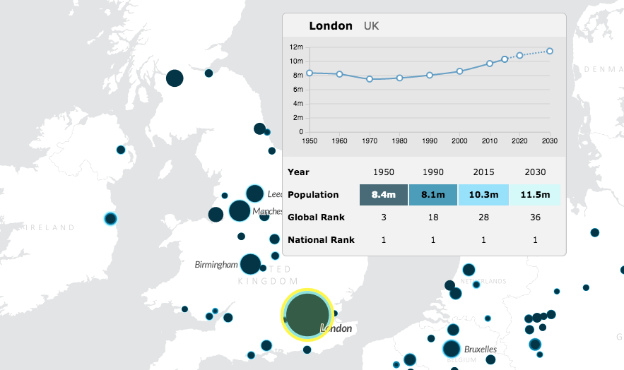
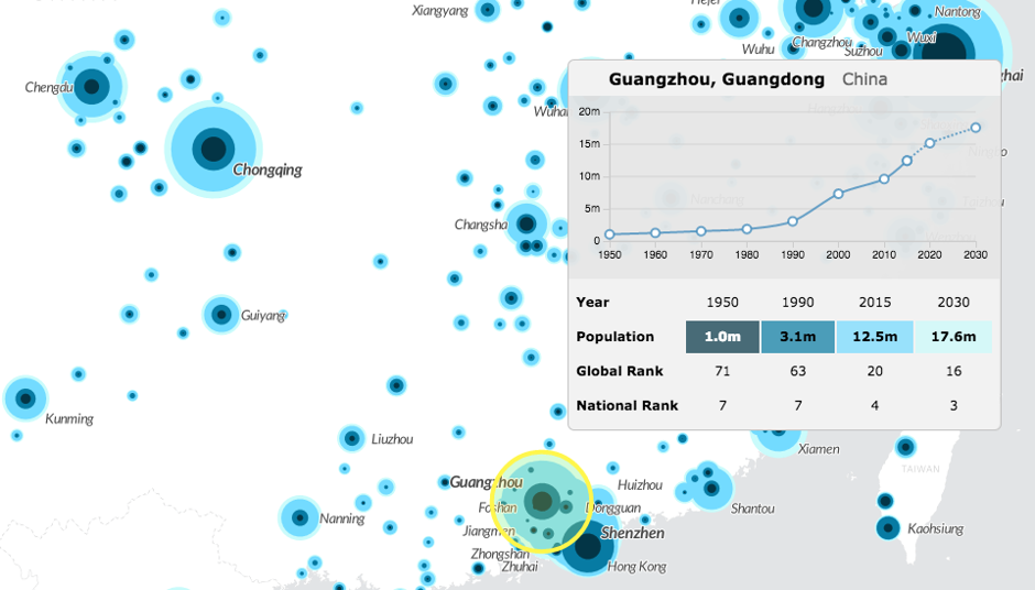
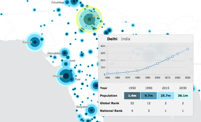
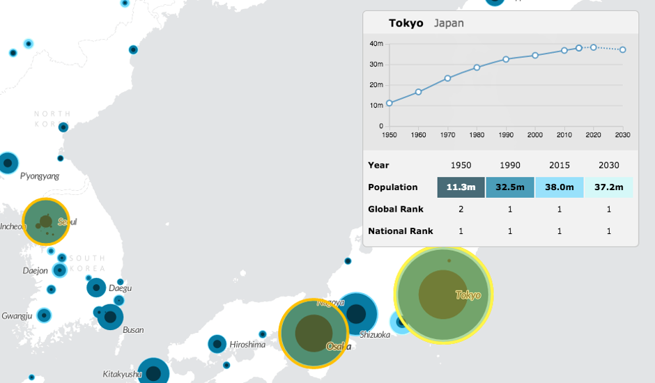
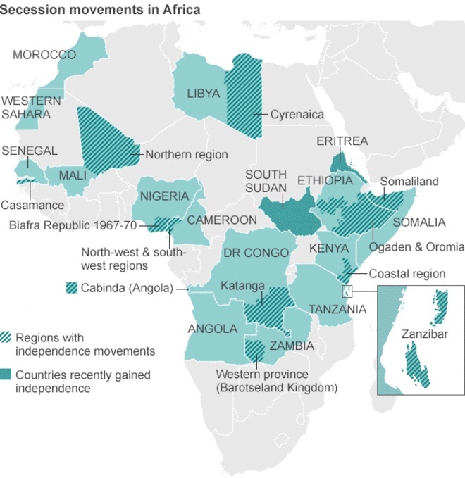
Originally posted by Kenneth W W Sims of Dept of Geology and Geophysics, University of Wyoming in Explorers Journal on December 4, 2015


Nyiragongo volcano towering above the city of Goma, Democratic Republic of the Congo. (Photo by Jacques Durieux)

Nyiragongo is a spectacular, active stratovolcano (11,385 feet above sea level) that towers over the city of Goma, Democratic Republic of Congo (4,600 feet above sea level) and hosts the world’s largest lava lake in its summit crater. Its highly unusual lavas are extremely fluid due to having some of the lowest silica levels on the planet, and they are capable of moving with velocities of tens of miles per hour.

Nyiragongo is also a dangerous volcano. It looms just 12 miles from the major population centers of Goma and neighboring Gisenyi, Rwanda. Destructive eruptions in 1977 and 2002 claimed many lives and devastated infrastructure in this war-torn region. With accelerating population growth creating rampant urban sprawl, the next eruption of either a lava flow or explosive “parasitic cone” could create an even more disastrous humanitarian crisis in this region.Nyiragongo lava lake. (Photo by John Catto)

With an eye toward better understanding volcanic hazards at Nyiragongo volcano and its threat to the cities of Goma and Gisenyi, University of Wyoming PhD student Erin Phillips, fellow mountaineer and photographer John Catto, and I have just been on an expedition to the DRC. In collaboration with scientists at the Observatoire Volcanologique de Goma (OVG) and Dario Tedesco from the University of Napoli in Italy, our explicit goal was to collect samples from Nyiragongo’s lava flows and parasitic cones.

With the right samples in hand, we are now measuring those sample’s isotopes (atoms which serve as little radioactive clocks in the rocks) to provide a time line of past eruptions in order to better understand how often and with what regularity Nyiragongo is erupting. This work will be conducted in my University of Wyoming High Precision Isotope Laboratory and at Janne Blichert-Toft’s laboratory at Ecole Normale Superieure de Lyon, France.

Three dimensional map showing the juxtaposition of the city of Goma to Nyiragongo and Nyamulagira volcanoes. Unfortunately Goma is located right on one of Nyiragongo’s major fractures. (Image created by Jacques Durieux) [This map does not necessarily reflect the current map policy of the National Geographic Society.]
A Volcanic Crisis Waiting to Happen?

Nyiragongo 2002 eruption destroying Goma. (Photo by Jacques Dureiux)

Goma is built on the southern fracture zone of the lower flanks of Nyiragongo. Since the 1994 Rwandan genocide, more than 5.5 million people have died in the Eastern Kivu from a war that has involvedgenocide, rape, murder, and exploitation of children as soldiers.

Central to the stability of this region is Goma—the center for the UN peacekeeping mission and dwelling place of more than a million residents and refugees. Clearly, a volcanic crisis in this war-torn region will create a major humanitarian catastrophe.Nyiragongo 2002 eruption destroying Goma. (Photo by Jacques Dureiux)

The lava flow on which the city of Goma is built was put in place sometime between A.D. 1208 and 1374 (based on 14C ages; Tuttle et al., 1990). Because these lavas are extremely fluid, this flow (or series of flows?) is speculated to have quickly covered the area where Goma exists today. As noted by the authors of this study, “If such an eruption were to occur in the future without adequate warning, the loss of life in Goma would be extensive.”

In addition to this “prehistoric” flow (before the modern city of Goma was founded around 1941), there have been two historic eruptions. In the 1977 eruption, between 74 and 400 people lost their lives (Durieux, 2003). In 2002, approximately 170 died and 120,000 lost their homes (Tedesco et al., 2007). Goma has since rebuilt on both the 1977 and 2002 lava flows.

In addition to these lava flows, numerous (around a hundred) “parasitic cones” of unknown age surround the Nyiragongo main cone. These are the cones of debris that form when there’s an eruption from a crack on the side of the main volcano. Some of Nyiragongo’s cones have erupted within the city of Goma. In fact the Goma Volcano Observatory (abbreviated “OVG”) is located directly on one of them. Many very large flows on the flanks of Nyiragongo are clearly young based on morphology, but are again of unknown age.The city of Goma rebuilt on the 2002 flow. (Photo by John Catto)

Current hazard maps for this region, such as those of Favalli et al. (2009) are based only on observations of the 1977 and 2002 eruptions at Nyiragongo. These authors themselves state that “the assumption that no other lava flows were produced in the last few hundred years is questionable. This is a limitation in the present hazard evaluation, which assumes that future venting will follow patterns observed in the 1977 and 2002 eruptions.”

Clearly there is an urgent need to provide a concrete scientific framework for hazard assessment of Nyiragongo and to plan ways to mitigate its risk for Goma and Gisenyi. However, awithout knowledge of Nyiragongo’s magma cycles and the ages of the flows and parasitic cones in the Goma region.Parasitic cones in the greater Goma region with refugee camps below. (Photo by John Catto)

Working on Nyiragongo: Collecting the Right Samples

On two previous research expeditions to Nyiragongo in 2007 and in 2010 (this time supported by a grant from the National Geographic Society), Dario Tedesco, Jacques Dureiux, John Catto, and I collected a suite of samples from the vertical walls in the summit crater, the outer flanks of the volcano, and even magma samples from the lava lake (as reported in National Geographic magazine). This has given us a head start on understanding both the volcano’s long-term and short-term eruptive history as reflected in the crater walls.

The primary objective of this year’s research expedition, funded by the National Science Foundation, was to sample the parasitic cones that surround Nyiragongo at last, both in the city and in the surrounding countryside.Ken Sims descends in the Nyiragongo crater to collect lava flows along the crater wall and from the lava lake below. (Photo by John Catto)Ken Sims in a thermal suit on the rim of the perched cone of the Nyiragongo lava lake to collect a known age magma sample. (Photo by Carsten Peters)Erin Phillips and Ken Sims on a parasitic cone outside of Goma with the Nyiragongo volcano in the background. (Photo by John Catto)

Sampling in the city was easy. For example, the excavation for the new OVG building on the side of Mount Goma, one of Nyiragongo’s parasitic cones, exposed the tephra (rock and ash) we were seeking. On another occasion, we found ourselves on the local chief’s property near the village of Monigi, on the outskirts of Goma. After crossing onto his property we were taken, by armed guards, to see him during his genteel Sunday afternoon gathering. After a jovial conversation we were provided with one of his shepherds and his enthusiastic son as our escorts to sample the tephra and lavas of the Bushwaga cone that we were seeking.

Collecting samples from cones and lava flows in the countryside was a little more difficult. Our travels often involved long bumpy four-wheel-drive roads and sometimes our objectives required long interesting treks into an outback that was rarely visited by anybody except those trying to eke out an existence gathering firewood or poaching charcoal from the deep interior of the Virunga National Park. But in almost all instances, because of our official affiliation with OVG, our driver Kuru’s diplomacy, and the persistent memory of Nyiragongo’s historical and deadly eruptions, the situation was rarely restive and everybody in the villages we visited were supportive of our scientific objectives. Nonetheless, no matter how lofty our goals and benevolent and diplomatic we wished ourselves to be, for those whose needs and concerns are more immediate we were still primarily Mzungus, “wandering white-skinned people of means,” that simply changed the pace and course of their day.Ken Sims sampling on a cone as crowd gathers to watch. (Photo by John Catto)

As a final part of our Nyiragongo expedition, PhD student Erin Phillips and I climbed to the summit of Nyiragongo with a small group of porters, a cook, and two armed park guards/rangers. This overnight trip enabled us to complete the Nyiragongo sampling I started in 2010 when I collected a dozen samples from the lava lake and the crater walls. It also provided an important opportunity for Erin to see Nyiragongo’s spectacular crater and lava lake firsthand.

The lava lake has changed dramatically since 2010; it is now smaller and has sunken deep into a crater on the third, lower terrace, whereas in 2010 it was perched about 30-50 feet above the third terrace, walled in by a spatter cone. Today it would be hard to get right to the edge of the lake to get a fresh sample like I did in 2010, but you could get a great gas sample right now. I guess I am not surprised it has all changed; it is after all a volcano: one of Earth’s “crucibles of change.”A mom carrying a load of charcoal while her daughter carries the baby deep in Virunga National Park. (Photo by John Catto)

An Unexpected Journey Into the Summit Crater of Nyamulagira

About ten miles northwest of Nyiragongo is Nyamulagira (also spelled Nyamuragira), a shield volcano that is often referred to as Africa’s most active volcano, and correctly so. There have been 28 confirmed eruptive events at Nyamulagira since 1938 and it has erupted regularly since the 1980s, with eruptions occurring every one to four years. It has been considered a lesser hazard for humans simply because of its remote location, but that is rapidly changing as the area between Goma and Sake (a village 15 miles to the west), becomes increasingly more populated and developed.Nyamulagira summit crater with new lava lake. (Photo by John Catto)

Although very near to Nyiragongo, Nyamulagira’s chemistry is significantly different, erupting with more ordinary alkaline lavas (about 43 percent silica), that form a classic shield volcano with low-angle slopes. Why is it that these two volcanoes are so close to each other and yet so chemically different? Do they come from different mantle sources, involve different magmatic process, or both?Nyamulagira’s new lava lake. (Photo by John Catto)

For the first time in over fifty years Nyamulagira now also hosts a massive lava lake in its summit crater, so a unique opportunity and highlight of this trip was flying into the active crater for three days. In stark contrast to the lush green crater I saw when I flew here in 2010, the crater is now devoid of living vegetation (except for a few small flowers starting to appear here and there), has many young flows covering its surface, and now contains a large degassing lava lake.

Dropped off by a UN helicopter and unescorted by armed guards, we were a simple party of nine: two Congolese from OVG (Mathieu Yalire Mapendano and Honoré Ciraba), three Italians (Dario Tedesco, Giovanni Giuffrida, and Gabriele Erba), one German (Nicole Bobrowski), and three U.S. citizens (John Catto, Erin Phillips, and myself). Despite lots of heavy rain it was an amazingly productive and simple trip. Three of us wandered about the crater all day collecting lavas from the recent flows. Four of the group measured gases emitted from the new lava lake, two of whom rappelled partway down to a lower terrace in the active crater to better collect these gases. The two scientists from OVG made important measurements and observations to put the crater’s changes into its historical context.Dario Tedesco and Mathieu Yalire Mapendano surveying the new lava lake of Nyamulagira. (Photo by John Catto)

Even in the depths of Nyamulagira’s crater, in the middle of Virunga National Park and deep in the high African jungle, we were reminded of our vulnerability to the persistent civil war that plagues the DRC. On the second afternoon, an extended period of heavy and small-arms fire from a nearby battle on the side of the volcano flanks riled everyone’s concern. It quickly became obvious, however, that this skirmish was outside the crater and not an issue for our group to be too concerned over.


Epilogue: Working in the DRC

Sample collection on Nyiragongo and Nyamulagira is always interesting. The toxic gases can get overwhelming when working close to the immense lava lakes, and when inside their craters there is the ever present, but not often conscious, fear of an eruption that could either be large and deadly, or small and simply exciting. There is also the awkward and tedious process of traveling long distances across young, jumbled `a`a lava flows, with a high potential of twisting your ankle or shredding your skin if you fall. But unlike most other volcanoes, these two also present the dangers of ongoing civil strife, which here in the DRC has resulted in more than 5.5 million deaths since 1994. It creates an edge that goes beyond a normal day’s work on an active volcano.

An armed escort deep in rebel territory helps us sample on the flanks of Nyamulagira in 2007. (Photo by John Catto)

The samples we have collected over the three field expeditions are numerous and cover a range of areas, morphologies, and apparent eruption times. It is now the responsibility of PhD student, Erin Phillips, to use isotopic clocks to determine the explicit eruption ages of these lava flows and to help us all better understand the basic science of these two volcanoes: Why are they where they are? Why are they so different, and what does that mean about the sources and processes responsible for their genesis and evolution? Besides helping to predict the next eruption, answering these questions is fundamental to our understanding of alkaline volcanism both in the African rift and globally.John Catto flying into the now active Nyamulagira crater. (Photo by Ken Sims)Erin Phillips walking in the Nyamulagira crater. (Photo by John Catto)

Sample locations on Nyamulagira and Nyiragongo avalaiable for our NSF funded study. [This map does not necessarily reflect the current map policy of the National Geographic Society.]References:


Chakrabarti, R., K.W.W. Sims, A.R Basu, M. Reagan, and J. Durieux, 2009, Timescales of Magmatic Processes and Eruption Ages of the Nyiragongo volcanics from 238U –230Th-226Ra-210Pb disequilibria, Earth and Planetary Science Letters, v. 288, doi:10.1016/j.epsl.2009.09.017.

Durieux, J., 2003a, Volcano Nyiragongo (D.R. Congo): Evolution of the crater lava lakes from the discovery to the present, Acta Vulcanologica, v. 15 (1-2).

Durieux, J., 2003b, Nyiragongo: The January 10th 1977 eruption, Acta Vulcanologica, v. 15 (1-2).

Favalli, M., G.D. Chirico, P. Papale, M.T. Pareschi, and E. Boschi, 2009, Lava flow hazard at Nyiragongo volcano, D.R.C., Bulletin of Volcanology, v. 71.

Head, E.M., A.M. Shaw, P.J. Wallace, K.W.W. Sims, and S.A. Carn, 2011, Insight into volatile behavior at Nyamuragira volcano (D.R. Congo, Africa) through olivine-hosted melt inclusions, Geochemistry, Geophysics, Geosystems, v. 12, doi:10.1029/2011GC003699.

Tedesco, D., O. Vaselli, P. Papale, S.A. Carn, M. Voltaggio, G.M. Sawyer, J. Durieux, M. Kaserek, and F. Tassi, 2007, January 2002 volcano-tectonic eruption of Nyiragongo volcano, Democratic Republic of Congo, Journal of Geophysical Research, v. 112.

Tuttle, M.L., J.P. Lockwood, and W.C. Evans, 1990, Natural hazards associated with Lake Kivu and adjoining areas of the Birunga Volcanic Field, Rwanda and Zaire, Central Africa, U.S. Geological Survey Open File Report 90-691.