
Clinton Nguyen
October 11, 2016
Google Maps is one of the most downloaded apps, and for good reason: It tells us where we're going.
But centuries before we had satellite imaging, high altitude photography, or smartphones, people were jumping into ships and measuring distances between land masses to draw maps.
Those measurements, of course, made for less accurate maps. But since then, our view of the world has sharpened.
Here are seven maps that show how far we've come in our understanding of the world.
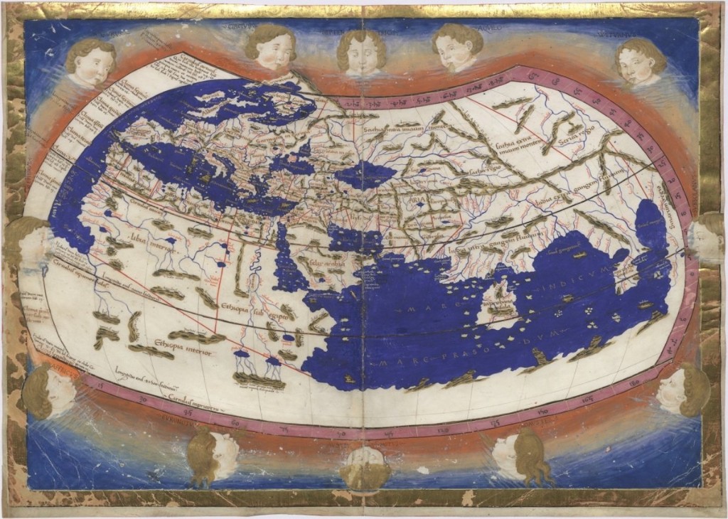
Ptolemy's "Geographia" was one of the first treatises on geography in the Western world.
Public Domain
Ptolemy's world map, originally described in the year 150, was one of the first to show longitude and latitude. It placed the meridian, or longitudinal center, in the then-unidentified "Fortunate Isles" to the west of Africa. That meridian would be used up until the Middle Ages.
The map was adapted and reprinted for centuries. The version shown above is German cartographer Nicolaus Germanus' 1467 iteration of Ptolemy's Geographia. In it, the Mediterranean Ocean borders a blocky African continent, which also appears to cover the entire southern end of the map, giving the impression that Africa connects back to Asia.
The Mercator world map made it easier for sailors to navigate.
Public domain
By the time this map was created in 1569, Christopher Columbus had sailed. Spanish conquistadors had brought back measurements — so many, in fact, that in 100 years, the rest of Asia was filled in, and the Americas, albeit looking like a blobby child's drawing, were finally described in detail.
Finnish cartographer Gerardus Mercator's world map was a product of these discoveries. It allowed for sailors to draw "rhumb lines," straight navigational lines on Mercator projected maps that allowed them to steer ships in one direction without constantly adjusting for the earth's curvature.
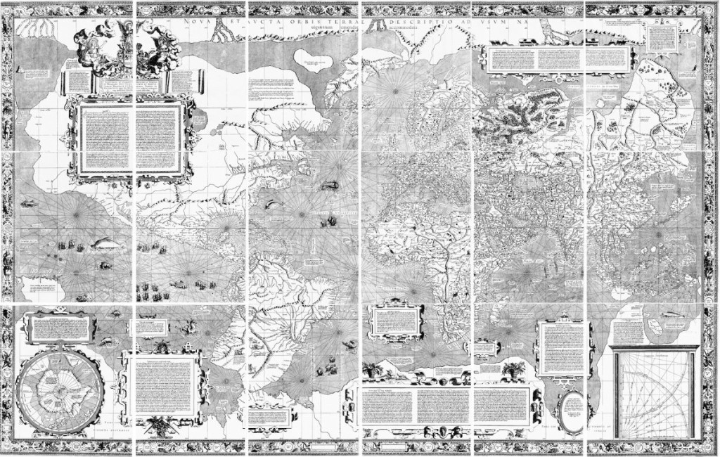
This early Dutch map, called the "Nova Totius Terrarum Orbis Tabula," shows a slightly more accurate America.
Public domain
Drawn by Henricus Hondius in 1630, this map provided new additions: Australia and New Zealand. Australia's outline is shown as New Holland, and New Zealand's presence is recognized though not entirely defined — its eastern and southern borders are cut off.
California is also depicted here as an island — an idea that first came about whenHernan Cortés briefly traveled to Baja California in 1535 and mistook the peninsula for a large island. North America's Pacific Northwest remains wholly undiscovered on this map, as does the part of Russia that extends out towards North America.
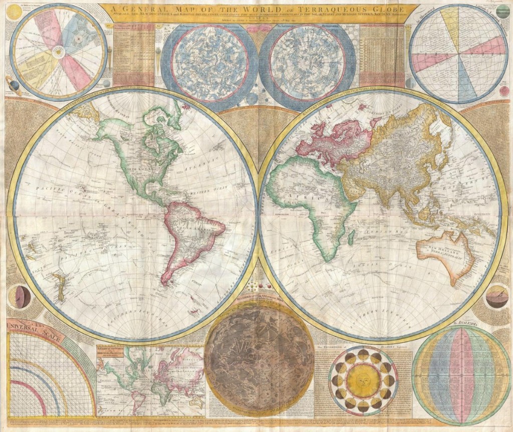
Samuel Dunn's 1794 map includes a moon and a more accurate America.
Public domain
After the United States became independent of Britain's rule, the British developed a better map of North America.
British cartographer Samuel Dunn added detail within the states themselves, correctly showing California as coastal land. The map also names names Boston, New York, Charleston, Long Island, Philadelphia, and numerous other cities in post-colonial America.
The Pacific Northwest is also further defined, as is Russia's Bering Strait, thanks to expeditions led by navigator James Cook. But detail is lacking in the centers of South America and Africa.
Interestingly, Dunn also included a fairly detailed map of the moon in his world map.
This 1854 map made by Scottish Protestants shows the world's religious divisions.
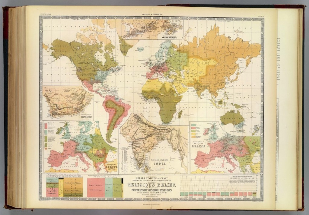
A. Keith Johnston, F.R.S.E./Public Domain
Scottish Protestants looking to spread their beliefs needed to know where they could go to convert more followers. Thus, they made a map of the world's religions.
According to Slate's history blog The Vault, different regions of the map are color-coded — "pagan" areas are shown in green and Buddhists are lumped in with heathens under the color orange.
The map shows where specific missionary efforts were conducted in India — missionary stations are labeled along a close-up of India's southern coast on the bottom half of the map. The list of languages next to the country was presumably meant to help missionaries learn to communicate with the locals.
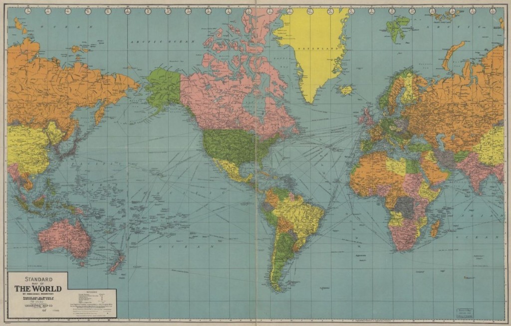
This world map, made in 1942, anticipated the coming age of air travel.
Library of Congress
This map was created by Geographia, a New Jersey-based map company that made its name with easy-to-read road maps. It contains copious amounts of detail. A number of major cities dot the US landscape, and South America, long undefined by mapmakers, has a few more rivers and many more cities drawn in.
Several clues indicate the map was designed with air travelers in mind. For one, there are lines showing common cross-ocean flights — many have the distance between a given destination and a US city written in (San Francisco to Japan, Brisbane to Honolulu, and so forth).
Considering there was a lot of advertising for airliners in the 50s, it's not hard to imagine that the mapmakers anticipated that more people would be looking to make trips they couldn't have 20 years earlier.
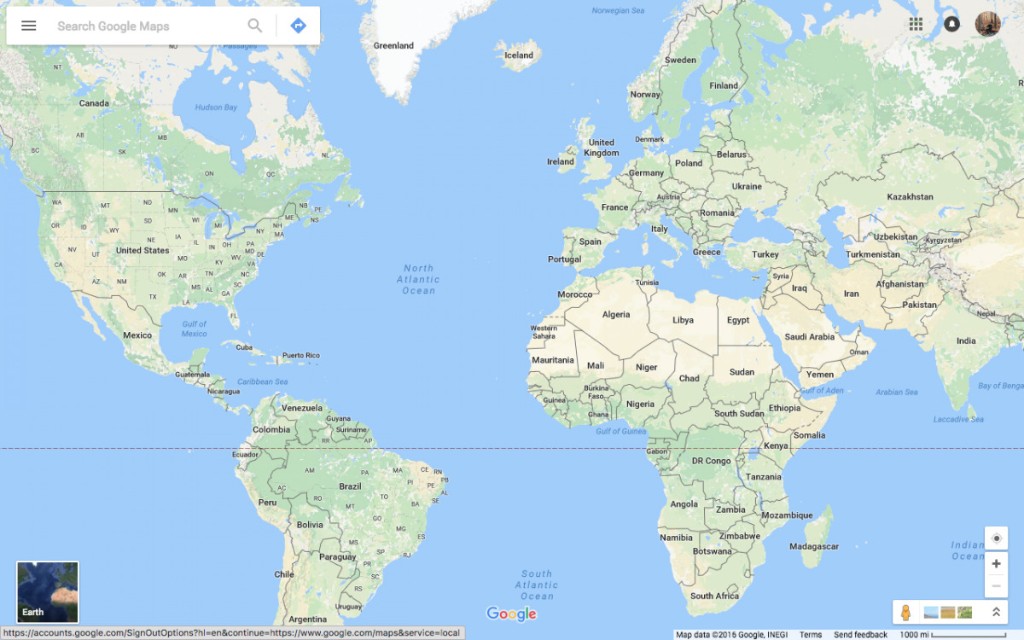
Today, Google Maps can virtually transport you to many inhabited places on Earth.
Google Maps/Screenshot
Google Street View has been around for a little while, but it would have been a magical concept to those who were stuck measuring landmasses on the horizon. Today, you can drag the little yellow man in the corner to virtually plop yourself into any place where someone has driven a car with a bunch of cameras attached.
In recent years, Google has amassed a trove of data to help fill in the gaps — the service is mapping undefined communities in Rio de Janeiro and letting peoplevirtually time travel.
Google Maps is now both the easiest way to find out how to get from Point A to Point B, and the closest thing we have to Dr. Who's time-traveling box, the TARDIS.
No comments:
Post a Comment