Visitors

Friday, October 28, 2016

Enormous crystal Geode discovered in Spain


A gigantic cave of crystals has been discovered in an old silver mine in Spain.

It occupies a space of 10.7 m³ (8 m long by 1.8 m wide by a 1.7 m average high) and is located at a depth of 50 m in the Pilar de Jaravía lead mine, in the Sierra del Aguilón, in the municipality of Pulpí, coinciding with the sea level, 3 km from the coast.The geode, which is eight metres (26ft) long and crammed full of gypsum prisms, has been put under police guard to prevent souvenir hunters from raiding the extraordinary natural phenomenon.

The geologist who announced the find, Javier Garcia-Guinea, wants to turn the site into a tourist attraction.

He said that up to 10 people could sit inside the geode - an object normally small enough to hold in your hands.

"Bending your body between the huge crystals is an incredible sensation," he said. "When I was young I dreamt of flying, but never to go into a geode internally covered with transparent crystals."


Schematic sketch of the geode and its dimensions. Credit : A. Rivera

Rumours of the existence of a giant gypsum geode had been circulating among mineral collectors since December.

But it was only on May that Javier Garcia-Guinea, from the Spanish Council for Scientific Research (CSIC) in Madrid, finally managed to track down the cave.

"The crystals are absolutely transparent and perfect," he said. The geologist has searched the international literature and can find no other object to compare in size.

The geode - essentially a rock cavity which has become lined with crystalline deposits - is eight meters in length, 1.8 metres wide and 1.7 metres high (26 feet by six by six).

The crystals of gypsum - hydrous calcium sulphate - are about half a metre in length.

The giant geode may have formed at the same time as a geological event called the Messinian salinity crisis.


At this time, about six million years ago, the Mediterranean Sea evaporated, depositing thick layers of salts. The same, salt-saturated fluids could have filled up the Spanish geode, which lies near the coast.

The drying out of the Mediterranean was probably caused by a restriction in the straits of Gibraltar, the sea's only connection with rest of the Earth's oceans.


Read more at http://www.geologyin.com/2016/10/enormous-crystal-geode-discovered-in.html#CZ7zhJKeRJTPExEB.99

Thursday, October 27, 2016

Maps are as much about art – and lies – as science

29 October 2016
Maps and the 20th Century: Drawing the Line
The British Library, 4 November until 1 March 2017


As a new exhibition at the British Library will show, the 20th century became the great age of the map – fuelled by war and travel

Stephen Bayley


Harry Beck's tube map sketch. Photo: Victoria & Albert Museum © TfL

In Australia, I have been told, the female pubic area is sometimes known as a ‘mapatasi’ because its triangular shape resembles a map of Tasmania. And since we are discussing cartography and the nether regions, it is wonderful to find in the British Library’s new exhibition, Maps and the 20th Century, that Countess Mountbatten wore knickers made out of second world war airmen’s silk escape maps.

Maps certainly colonise our imaginations in many different ways. The allies in Iraq had a ‘road map’ rather than a strategy. So much of personal value can be lost in the creases and folds of our own ‘mental maps’. And couples who often travel in cars will know the shrieking horrors of the map row, more complicated nowadays since satnav offers a third and often contrary route selection.

If you visit the British Library you might use the Tube or go by road. So you will probably consult the Underground map or an A-Z. Here are two examples of maps as illusions, or, at least, persuasive abstractions.

Harry Beck was the London Transport engineering draftsman who created the modern Tube map. With great art he decided to use only verticals, horizontals and diagonals while, for clarity, he greatly enlarged the city’s central area. The result is an all-time, trumpets-of-Jericho classic of graphic design, admired and copied everywhere.

But if you see a technical plan of the Tube lines as they actually are, it resembles a bowl of spaghetti spilt on the floor. The disparity between tangled ‘reality’ and Beck’s superlative, reductive modernist capriccio is shocking. It is not a faithful reproduction of underlying facts, but a lie that works. Therein is a central truth: the human mapping instinct is as much art as it is science.

Then there is Phyllis Pearsall’s A-Z, whose mapping protocols prioritise streets and diminish everything else. These popular maps are so familiar that we do not easily see how very odd it is to have, say, Fentiman Road given more pictorial status than Buckingham Palace. The A-Z is a map that assumes surface movement on roads between places is more important than the places themselves. If you were looking for a metaphor of the 20th century, it’s in there somewhere.


German propaganda poster: a spider with the face of John Bull devours a French soldier at Calais. Photo: British Library

Although maps were still a novelty circa 1900, the 20th century became their great age: of the four million maps held by the British Library, two thirds were produced in this period. War was a stimulus: in 1914 the British Expeditionary Force mapping department had a staff of one officer with an assistant. By the end of the first world war 5,035 million map sheets had been printed. Reporting on the military campaigns, newspapers began to reproduce maps. At about this time, geography became a university subject.

There is a weird beauty, a vicarious fascination, in a relief map of Ypres in 1916, produced by the Ordnance Survey in Southampton. It is a technically correct and amoral description of a theatre of atrocious carnage, but it is good to know that scarlet majors at the base had excellent intelligence about contour lines while speeding glum heroes up the line to death.

Or what about Luftwaffe aerial photographs of the Liverpool–Birkenhead region in 1940 with potential targets outlined in red? Haunting to see great buildings marked for demolition just hours before the bombs fell. Here was a map that told the future … of slums. In 2012 the National Archives launched an interactive Blitz map and an app that allowed you to point your phone at a building to see — a nice surreal touch, this — if it had been bombed in 1940.

Maps, of course, reveal the psychological states of their creators as much as they describe topography. Cartographers create maps and maps create our mindset. Thus there have been radical attempts to change perceptions. Was a third of the planet really once Imperial pink? During the second world war, the bizarre azimuthal equidistant projection showed the North Polar Sea at the centre of the world, with the continents all of a piece and trade routes and battlelines clearly drawn.

In the Fifties the Peters projection, dismissed by many academic cartographers as a prank, attempted to realign the world so as to give more consideration to territories neglected by convention. In the same decade, Guy Debord created psychogeography.

Popular travel has been as big a stimulus to map design and production as war. New generations of cyclists and motorists required data. Michelin encouraged people to burn more rubber by luring them to gastronomic destinations, providing fine maps to navigate their ‘voyage’ or ‘detour’ towards lunch or dinner.


Twenties proofs of an OS tourist map. Photo: British Library


Personally, I find Michelin maps completely engrossing and when occasionally bored I will flip open an Atlas routier at, say, page 173 square G2 and begin a reverie about what it would be like to travel the D15 between Crosses and Jussy-Champagne. In Germany, they used to have charming publications called Ihr Zugbegleiter, a little map that showed what was rushing past the train window. Perhaps high-speed rail made it an impractical blur.

And then there is the poetry. In ‘The Hunting of the Snark’, Lewis Carroll writes:

He had brought a large map representing the sea,

Without the least vestige of land:

And the crew were much pleased when they found it to be

A map they could all understand.

It was, of course, a map that was completely blank.


Now new technologies are changing the parameters of what a map is. The first thing you see in the British Library is a population cartogram: a map that measures people, not the earth’s surface. Charles Booth’s Poverty Maps of London (1886–1903) were a prediction of new charts by the Italian architect Carlo Ratti, who quantifies internet traffic and redraws, say, Manhattan using bandwidth rather than street width as his measure. Ratti has also fitted air-quality sensors on bikes to produce pollution maps. A.A. Milne’s Hundred Acre Wood suddenly seems very distant.

These same new digital technologies mean that the 20th century’s output of paper maps is not likely ever to be exceeded, but there remains a very keen popular interest in mapping, coloured by a nostalgic sense of loss about a world the Ordnance Survey suggested existed circa 1935: a wholesome-looking chap with a pipe leans on a five-bar gate consulting a map in front of a thatched cottage with a picturesque lane leading into a wood.


Map of the Atlantic Ocean floor, by Heinrich Berann, for National Geographic Magazine, June 1968. Photo: National Geographic


The best maps are not always objective and some are useless in practical terms. Herman Melville said: ‘It is not down in any map; true places never are.’ At just about the moment Google Earth removed all topographic secrets from the planet, a surprise bestseller of 2010 was Judith Schalansky’s Atlas of Remote Islands — Fifty Islands I Have Not Visited and Never Will. The subtitle is revealing; so, too, is the fact that Schalansky grew up in East Germany when travel was a fantasy.

And still we come back to psychological states. I have seen a scary Christian map of the world with its ‘impenetrable hedge of sin’ (where Satan installed dancing schools and delivered Sunday papers). Or think of Saul Steinberg’s marvellous 1975 New Yorker cover ‘View of the World from 9th Avenue’, with Manhattan at the centre of the world and insignificant China and troublesome Africa consigned to the peripheries. Meanwhile, Roald Dahl said that the reason they have blank pages at the back of atlases is ‘for new countries. You’re meant to fill them in yourself.’

Meanwhile, if not a new country, Europe is certainly changing shape. Since 2002 the euro coin has shown a map of the Continent including only EU members, which at the time included the British Isles. Of course, that must soon change to reflect political reality. And how very odd it will look.

Sunday, October 23, 2016

How climate change triggers earthquakes, tsunamis and volcanoes

The Guardian
Bill McGuire
Oct 16, 2016

Global warming may not only be causing more destructive hurricanes, it could also be shaking the ground beneath our feet


Rescue workers in Bhaktapur, Nepal, search for survivors after the 2015 earthquake.
Photograph: Niranjan Shrestha/AP


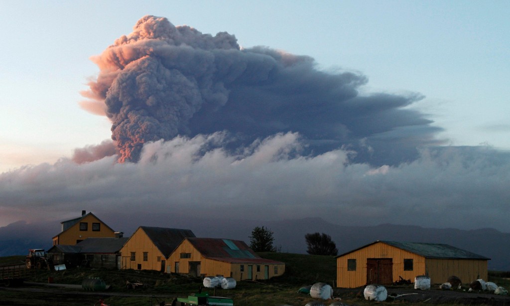
A cloud of ash rises from the volcano under the Eyjafjallajökull glacier in Iceland in May, 2010, causing chaos for millions of airline passengers as flights were cancelled across Europe.
Photograph: Ingolfur Juliusson/Reuters


Devastating hurricane? More than 1,000 lives lost? It must be climate change! Almost inevitably, Hurricane Matthew’s recent rampage across the Caribbean and south-eastern US has been fingered by some as a backlash of global warming driven by humanity’s polluting activities, but does this really stack up?


The short answer is no. Blame for a single storm cannot be laid at climate change’s door, as reinforced by the bigger picture. The current hurricane season is by no means extraordinary, and the last few seasons have actually been very tame. The 2013 season saw no major hurricanes at all and tied with 1982 for the fewest hurricanes since 1930. This, in turn, is no big deal as there is great year-on-year variability in the level of hurricane activity, which responds to various natural factors such as El Niño and the so-called Atlantic Multidecadal Oscillation, as well as the progressive warming of the oceans as climate change bites harder.


The current consensus holds that while a warmer world will not necessarily mean more hurricanes, it will see a rise in the frequency of the most powerful, and therefore more destructive, variety. This view was supported recently by Kerry Emanuel, a hurricane scientist at MIT, who pointed to Matthew as a likely sign of things to come.


Debate within the hurricane science community has in recent decades been almost as hostile as the storms themselves, with researchers, on occasion, even refusing to sit on the same panels at conferences. At the heart of this sometimes acrimonious dispute has been the validity of the Atlantic hurricane record and the robustness of the idea that hurricane activity had been broadly ratcheting up since the 1980s. Now, the weight of evidence looks to have come down on the side of a broad and significant increase in hurricane activity that is primarily driven by progressive warming of the climate. For many, the bottom line is the sea surface temperature, which is a major driver of hurricane activity and storm intensification. Last year saw the warmest sea temperatures on record, so it should not be a surprise. As Michael Mann, an atmospheric scientist at Penn State University, says: “It isn’t a coincidence that we’ve seen the strongest hurricane in both hemispheres [western and eastern] within the last year.” As the Atlantic continues to heat up, the trend is widely expected to be towards more powerful and wetter storms, so that Matthew might seem like pretty small beer when looked back on from the mid-century.


As with hurricanes, Pacific typhoons and the mid-latitude storms that periodically batter the UK and Europe are forecast to follow a similar pattern in an anthropogenically warmed world. Storm numbers may not rise, but there is likely to be an escalation in the frequency of the bigger storm systems, which tend to be the most destructive. An additional concern is that mid-latitude storms may become clustered, bringing the prospect of extended periods of damaging and disruptive winds. The jury is out on whether climate change will drive up the number of smaller, but potentially ruinous vortices of solid wind that make up tornadoes, although an apparent trend in the US towards more powerful storms has been blamed by some on a warming atmosphere.


Tornadoes, typhoons, hurricanes and mid-latitude storms – along with heatwaves and floods – are widely regarded as climate change’s shock troops; forecast to accelerate the destruction, loss of life and financial pain as planet Earth continues to heat up. It would be wrong to imagine, however, that climate change and the extreme events it drives are all about higher temperatures and a bit more wind and rain.


The atmosphere is far from isolated and interacts with other elements of the so-called “Earth system”, such as the oceans, ice caps and even the ground beneath our feet, in complex and often unexpected ways capable of making our world more dangerous. We are pretty familiar with the idea that the oceans swell as a consequence of the plunging atmospheric pressure at the heart of powerful storms, building surges driven onshore by high winds that can be massively destructive. Similarly, it does not stretch the imagination to appreciate that a warmer atmosphere promotes greater melting of the polar ice caps, thereby raising sea levels and increasing the risk of coastal flooding. But, more extraordinarily, the thin layer of gases that hosts the weather and fosters global warming really does interact with the solid Earth – the so-called geosphere — in such a way as to make climate change an even bigger threat.


This relationship is marvellously illustrated by a piece of research published in the journal Nature in 2009 by Chi-Ching Liu of the Institute of Earth Sciences at Taipei’s Academia Sinica. In the paper, Liu and his colleagues provided convincing evidence for a link between typhoons barrelling across Taiwan and the timing of small earthquakes beneath the island. Their take on the connection is that the reduced atmospheric pressure that characterises these powerful Pacific equivalents of hurricanes is sufficient to allow earthquake faults deep within the crust to move more easily and release accumulated strain. This may sound far fetched, but an earthquake fault that is primed and ready to go is like a coiled spring, and as geophysicist John McCloskey of the University of Ulster is fond of pointing out, all that is needed to set it off is – quite literally – “the pressure of a handshake”.


Perhaps even more astonishingly, Liu and his team proposed that storms might act as safety valves, repeatedly short-circuiting the buildup of dangerous levels of strain that otherwise could eventually instigate large, destructive earthquakes. This might explain, the researchers say, why the contact between the Eurasian and Philippine Sea tectonic plates, in the vicinity of Taiwan, has far less in the way of major quakes than further north where the plate boundary swings past Japan.


In a similar vein, it seems that the huge volume of rain dumped by tropical cyclones, leading to severe flooding, may also be linked to earthquakes. The University of Miami’s Shimon Wdowinski has noticed that in some parts of the tropics – Taiwan included – large earthquakes have a tendency to follow exceptionally wet hurricanes or typhoons, most notably the devastating quake that took up to 220,000 lives inHaiti in 2010. It is possible that floodwaters are lubricating fault planes, but Wdowinski has another explanation. He thinks that the erosion of landslides caused by the torrential rains acts to reduce the weight on any fault below, allowing it to move more easily.


It has been known for some time that rainfall also influences the pattern of earthquake activity in the Himalayas, where the 2015 Nepal earthquake took close to 9,000 lives, and where the threat of future devastating quakes is very high. During the summer monsoon season, prodigious quantities of rain soak into the lowlands of the Indo-Gangetic plain, immediately to the south of the mountain range, which then slowly drains away over the next few months. This annual rainwater loading and unloading of the crust is mirrored by the level of earthquake activity, which is significantly lower during the summer months than during the winter.


And it isn’t only earthquake faults that today’s storms and torrential rains are capable of shaking up. Volcanoes seem to be susceptible too. On the Caribbean island of Montserrat, heavy rains have been implicated in triggering eruptions of the active lava dome that dominates the Soufrière Hills volcano. Stranger still, Alaska’s Pavlof volcano appears to respond not to wind or rain, but to tiny seasonal changes in sea level. The volcano seems to prefer to erupt in the late autumn and winter, when weather patterns are such that water levels adjacent to this coastal volcano climb by a few tens of centimetres. This is enough to bend the crust beneath the volcano, allowing magma to be squeezed out, according to geophysicist Steve McNutt of the University of South Florida, “like toothpaste out of a tube”.


If today’s weather can bring forth earthquakes and magma from the Earth’s crust, it doesn’t take much to imagine how the solid Earth is likely to respond to the large-scale environmental adjustments that accompany rapid climate change. In fact, we don’t have to imagine at all. The last time our world experienced serious warming was at the end of the last ice age when, between about 20,000 and 10,000 years ago, temperatures rose by six degrees centigrade, melting the great continental ice sheets and pushing up sea levels by more than 120m.


These huge changes triggered geological mayhem. As the kilometres-thick Scandinavian ice sheet vanished, the faults beneath released the accumulated strain of tens of millennia, spawning massive magnitude eight earthquakes. Quakes of this scale are taken for granted today around the Pacific Ocean’s “Ring of Fire”, but they are completely out of place in Santa’s Lapland. Across the Norwegian Sea, in Iceland, the volcanoes long buried beneath a kilometre of ice were also rejuvenated as the suffocating ice load melted away, prompting a “volcano storm” about 12,000 years ago that saw the level of activity increase by up to 50 times.


Now, global average temperatures are shooting up again and are already more than one degree centigrade higher than during preindustrial times. It should come as no surprise that the solid Earth is starting to respond once more. In southern Alaska, which has in places lost a vertical kilometre of ice cover, the reduced load on the crust is already increasing the level of seismic activity. In high mountain ranges across the world from the Caucasus in the north to New Zealand’s southern Alps, longer and more intense heatwaves are melting the ice and thawing the permafrost that keeps mountain faces intact, leading to a rise in major landslides.


Does this all mean that we are in for a more geologically active future as well as a hotter and meteorologically more violent one? Well, no one is suggesting that we will see a great surge in the number of earthquakes and volcanic eruptions. As always, these will be controlled largely by local geological conditions. Where an earthquake fault or volcano is primed and ready to go, however, climate change may provide that extra helping hand that brings forward the timing of a quake or eruption that would eventually have happened anyway.


As the world continues to heat up, any geological response is likely to be most obvious where climate change is driving the biggest environmental changes – for example, in areas where ice and permafrost are vanishing fast, or in coastal regions where rising sea levels will play an increasing role. Freysteinn Sigmundsson of the Nordic Volcanological Centre observes that the centre of Iceland is now rising by more than three centimetres a year in response to shrinking glaciers. Studies undertaken by Sigmundsson and his colleagues forecast that the reduced pressures that result will lead to the formation of significant volumes of new magma deep under Iceland. Whether this will translate into more or bigger eruptions remains uncertain, but the aviation chaos that arose from the Eyjafjallajökull eruption in 2010provides a salutary warning of the disruption that any future increase in Icelandic volcanic activity may cause across the North Atlantic region.


Volcanologist Hugh Tuffen, of Lancaster University, is worried about the stability of the more than 10% of active volcanoes that are ice-covered. He says that “climate change is driving rapid melting of ice on many volcanoes worldwide, triggering unloading as ice is removed. As well as encouraging magma to rise to the surface, leading to increased volcanic activity, removal of ice can also destabilise steep volcano flanks, making hazardous landslides more likely.”


The potential for more landslides is also likely to be a problem in high mountain ranges as the ice cover that stabilises rock faces vanishes. Christian Huggel of the University of Zurich has warned that “in densely populated and developed regions such as the European Alps, serious consequences have to be considered from [future] large slope failures”.


Looking ahead, one of the key places to watch will be Greenland, where recent findings by a research team led by Shfaqat Khan of Denmark’s Technical University reveal a staggering loss of 272bn tonnes of ice a year over the last decade. GPS measurements show that, like Scandinavia at the end of the last ice age, Greenland and the whole of the surrounding region is already rising in response to the removal of this ice load. Andrea Hampel of the University of Hannover’s Geological Institute, who with colleagues has been studying this behaviour, is concerned that “future ice loss may trigger earthquakes of intermediate to large magnitude if the crust underneath the modern ice cap contains faults prone to failure”.


More earthquakes in Greenland might not seem like a big deal, but this could have far wider ramifications. About 8,200 years ago, an earthquake linked to the uplift of Scandinavia, triggered the Storegga Slide; a gigantic undersea sediment slide that sent a tsunami racing across the North Atlantic. Run-up heights were more than 20m in the Shetlands and six metres along the east coast of Scotland, and the event has been blamed for the flooding of Doggerland; the inhabited Mesolithic landmass that occupied what is now the southern North Sea.


The submerged margins of Greenland are currently not very well mapped, so the likelihood of a future earthquake triggering a landslide capable of generating a major tsunami in the North Atlantic is unknown. Dave Tappin, a tsunami expert at the British Geological Survey, points out that one large, undersea landslide has been identified off the coast of Greenland, but suspects that there may not be sufficient sediment to generate landslides as large as Storegga. Nonetheless, the seismic revival of Greenland is certainly a geological response to climate change that we need to keep an eye on.


The bottom line in all of this is that as climate change tightens its grip, we should certainly contemplate more and bigger Hurricane Matthews. However, when it comes to the manifold hazardous by-blows of an overheating planet, and especially those involving the ground we stand on, we must also be prepared to expect the unexpected.


Bill McGuire is professor emeritus in geophysical and climate hazards at UCL. His current book is Waking the Giant: How a Changing Climate Triggers Earthquakes, Tsunamis and Volcanoes.

Thursday, October 20, 2016

ARCTIDA: Scientists find two ancient continents existed before Arctic

Core Spirit
October 17, 2016

The modern Arctic turns out to be the third incarnation of an ancient landmass at the top of the world. A group of Siberian scientists has discovered that the northern most continent broke apart twice, and not once as was previously thought.

An ancient continent named Arctida formed around one billion years ago, but then split apart around 750 million years ago, only to come back together again after another 500 million years, TASS reports, citing the findings of the Institute of Petroleum Geology and Geophysics of the Russian Academy of Sciences and Novosibirsk State University.

“There were at least two continents and not one as it was thought before,” head of the General and Regional Geology Department at Novosibirsk State University and leading author of the study, Dmitry Metelkin, said.

The structure of the continent, however, did not stay the same in both instances when the constituent elements of Arctida came back together again.


For example, archipelagos in Severnaya Zemlya, Svalbard, the New Siberian Islands, a part of the Taimyr Peninsula, the northern tips of Alaska and Chukotka, islands near Greenland and the Kara Sea shelf were created only the second time Arctida disintegrated.

A method, known as paleo-magnetic analysis allowed the scientists to see how the position of the Earth’s crust changed through time and, thus, come to this major conclusion.


The study is based on paleo-magnetic data from over 20 years of Arctic explorations. Scientists had to undertake numerous dangerous missions to the islands of the Arctic Ocean to collect it.

The results were published in the Precambrian Research scientific journal.

The Arctic has long been a sore point for the countries that surround it, including Russia, Canada, the United States, Denmark (Greenland), and Norway. The northern countries have struggled for dominance in the region, which is believed to hold enormous deposits of oil and natural gas.

Wednesday, October 19, 2016

A newspaper clipping from 1912 that anticipates the global warming potential of burning coal is authentic and consistent with the history of climate science.


Alex Kasprak
Oct 18, 2016


CLAIM: A 14 August 1912 article from a New Zealand newspaper contains a brief story about how burning coal might produce future warming by adding carbon dioxide to the atmosphere.

TRUE!


ORIGIN:On 11 October 2016, the Facebook page “Sustainable Business Network NZ” posted a photograph of a clipping from the 14 August 1912 edition of the Rodney and Otamatea Times, Waitemata and Kaipara Gazettethat included a brief item headlined “Coal Consumption Affecting Climate”:

The furnaces of the world are now burning about 2,000,000,000 tons of coal a year. When this is burned, uniting with oxygen, it adds about 7,000,000,000 tons of carbon dioxide to the atmosphere yearly. This tends to make the air a more effective blanket for the earth and to raise its temperature. The effect may be considerable in a few centuries.

This article’s authenticity is supported by the fact it can be found in the digital archives of the National Library of New Zealand.

Further attesting to its authenticity (and perhaps its role as a bit of stock news used to fill space) is that an identical story had appeared in an Australian newspaper a month prior, in the 17 July 1912, issue of The Braidwood Dispatch and Mining Journal, as found in the digital archives of the National Library of Australia.

Some online commenters expressed skepticism over the notion that such a clear understanding of the mechanisms relating to greenhouse gases existed in 1912 or that anyone back then then would suggested that humans could play a role in altering their concentration. In fact, the timing of these news clips is consistent with the historical record.

The first person to use the term “greenhouse gases” was a Swedish scientist named Svante Arrhenius in 1896. In a paper published that year, he made an early calculation of how much warmer the Earth was thanks to the energy-trapping nature of some of the gases in the atmosphere. Even at this early stage, he understood that humans had the potential to play a significant role in changing the concentration of at least one of those gases, carbon dioxide (carbonic acid back then):

The world's present production of coal reaches in round numbers 500 millions of tons per annum, or 1 ton per km of earth's surface. Transformed into carbonic acid, this quantity would correspond to about a thousandth part of the carbonic acid in the atmosphere.

Though he didn’t explicitly say in that paper that human activity could warm the planet, Arrhenius would go on to make that argument in later works. A 2008 tribute to Arrhenius published by the Royal Swedish Academy of Engineering Sciences stated that his ideas about coal and climate were popular and well known in his day but fell out of favor for a while after his death in 1927:

While Arrhenius’ prediction [of warming] received great public interest, this typically waned in time but was revived as an important global mechanism by the great atmospheric physicist Carl Gustaf Rossby who initiated atmospheric CO2 measurements in Sweden in the 1950s.

In this sense, the content and date of the newspaper clips in question are consistent with both what was known to scientists about greenhouse gases then and what the general public was interested in at the time.

ORIGINALLY PUBLISHED: 18 October 2016

Tuesday, October 18, 2016

7 maps that show how our understanding of the world changed dramatically

Business Insider
Clinton Nguyen
October 11, 2016

Google Maps is one of the most downloaded apps, and for good reason: It tells us where we're going.

But centuries before we had satellite imaging, high altitude photography, or smartphones, people were jumping into ships and measuring distances between land masses to draw maps.

Those measurements, of course, made for less accurate maps. But since then, our view of the world has sharpened.

Here are seven maps that show how far we've come in our understanding of the world.


Ptolemy's "Geographia" was one of the first treatises on geography in the Western world.


Public Domain


Ptolemy's world map, originally described in the year 150, was one of the first to show longitude and latitude. It placed the meridian, or longitudinal center, in the then-unidentified "Fortunate Isles" to the west of Africa. That meridian would be used up until the Middle Ages.

The map was adapted and reprinted for centuries. The version shown above is German cartographer Nicolaus Germanus' 1467 iteration of Ptolemy's Geographia. In it, the Mediterranean Ocean borders a blocky African continent, which also appears to cover the entire southern end of the map, giving the impression that Africa connects back to Asia.


The Mercator world map made it easier for sailors to navigate.


Public domain


By the time this map was created in 1569, Christopher Columbus had sailed. Spanish conquistadors had brought back measurements — so many, in fact, that in 100 years, the rest of Asia was filled in, and the Americas, albeit looking like a blobby child's drawing, were finally described in detail.

Finnish cartographer Gerardus Mercator's world map was a product of these discoveries. It allowed for sailors to draw "rhumb lines," straight navigational lines on Mercator projected maps that allowed them to steer ships in one direction without constantly adjusting for the earth's curvature.


This early Dutch map, called the "Nova Totius Terrarum Orbis Tabula," shows a slightly more accurate America.


Public domain


Drawn by Henricus Hondius in 1630, this map provided new additions: Australia and New Zealand. Australia's outline is shown as New Holland, and New Zealand's presence is recognized though not entirely defined — its eastern and southern borders are cut off.

California is also depicted here as an island — an idea that first came about whenHernan Cortés briefly traveled to Baja California in 1535 and mistook the peninsula for a large island. North America's Pacific Northwest remains wholly undiscovered on this map, as does the part of Russia that extends out towards North America.

Samuel Dunn's 1794 map includes a moon and a more accurate America.


Public domain


After the United States became independent of Britain's rule, the British developed a better map of North America.

British cartographer Samuel Dunn added detail within the states themselves, correctly showing California as coastal land. The map also names names Boston, New York, Charleston, Long Island, Philadelphia, and numerous other cities in post-colonial America.

The Pacific Northwest is also further defined, as is Russia's Bering Strait, thanks to expeditions led by navigator James Cook. But detail is lacking in the centers of South America and Africa.

Interestingly, Dunn also included a fairly detailed map of the moon in his world map.


This 1854 map made by Scottish Protestants shows the world's religious divisions.


A. Keith Johnston, F.R.S.E./Public Domain

Scottish Protestants looking to spread their beliefs needed to know where they could go to convert more followers. Thus, they made a map of the world's religions.

According to Slate's history blog The Vault, different regions of the map are color-coded — "pagan" areas are shown in green and Buddhists are lumped in with heathens under the color orange.

The map shows where specific missionary efforts were conducted in India — missionary stations are labeled along a close-up of India's southern coast on the bottom half of the map. The list of languages next to the country was presumably meant to help missionaries learn to communicate with the locals.


This world map, made in 1942, anticipated the coming age of air travel.


Library of Congress

This map was created by Geographia, a New Jersey-based map company that made its name with easy-to-read road maps. It contains copious amounts of detail. A number of major cities dot the US landscape, and South America, long undefined by mapmakers, has a few more rivers and many more cities drawn in.

Several clues indicate the map was designed with air travelers in mind. For one, there are lines showing common cross-ocean flights — many have the distance between a given destination and a US city written in (San Francisco to Japan, Brisbane to Honolulu, and so forth).

Considering there was a lot of advertising for airliners in the 50s, it's not hard to imagine that the mapmakers anticipated that more people would be looking to make trips they couldn't have 20 years earlier.


Today, Google Maps can virtually transport you to many inhabited places on Earth.


Google Maps/Screenshot


Google Street View has been around for a little while, but it would have been a magical concept to those who were stuck measuring landmasses on the horizon. Today, you can drag the little yellow man in the corner to virtually plop yourself into any place where someone has driven a car with a bunch of cameras attached.

In recent years, Google has amassed a trove of data to help fill in the gaps — the service is mapping undefined communities in Rio de Janeiro and letting peoplevirtually time travel.

Google Maps is now both the easiest way to find out how to get from Point A to Point B, and the closest thing we have to Dr. Who's time-traveling box, the TARDIS.

Monday, October 17, 2016

Why the risk of the 'Big One' in B.C. is heightened every 14 months

1,000s of tremors — earthquake precursors in slow slip event — are expected on Vancouver Island


By Johanna Wagstaffe
Oct 10, 2016


The last slow slip event that occurred in B.C. and northern Washington. The tremors are colour-coded by time (oldest in blue, newest in red) from December 22 - January 16, 2016. Almost 8000 slow slip tremor earthquakes were recorded. (Pacific Northwest Seismic Network)


Roughly every 14 months, for about a two week period, seismologist Alison Bird won't park underground.

That's because she knows the chances are higher of a big earthquake striking.

Almost like clockwork, thousands of tiny tremors rumble unfelt across the Pacific Northwest indicating a 'slow-slip' event is taking place.

Bird, an earthquake seismologist for the Geological Survey of Canada, says it's something scientists discovered at the office in Victoria when they noticed an unusual pattern on seismograms.

"Every 14 months or so there's a sudden reversal of movement [of Vancouver island] for a couple of weeks," she said

"It's buckling in that one direction but suddenly it settles a little bit ... it could be a last straw scenario, [where] just that little bit of extra stress that's going to cause that rupture to trigger ... the megathrust earthquake."


The first image shows every tremor reported on Vancouver Island during a three-week period in the summer of 2016. The second image shows every tremor reported during the last slow slip, from December 22, 2015 to January 16, 2016. (Pacific Northwest Seismic Network)


Stress is building

The Cascadia Subduction Zone is a 1000 km fault that runs from Northern Vancouver Island to Northern California. The fault itself is a boundary between two tectonic plates: the Juan de Fuca tectonic plate is moving towards, and getting shoved under the North American plate that we live on.

A section of that boundary has become locked together — the plates are no longer sliding smoothly. So all that forward movement is being stored up inside the rocks, waiting for the day that the energy will be released as a catastrophic megathrust earthquake, colloquially known on the Pacific Northwest as the 'Big One'. 

But why is there a heightened concern that the 'Big One' will happen during a slow slip?

"What we think is happening is that whenever there's that reversal, for those two weeks it's loading extra stress onto the locked zone," she said.

"So if that lock zone is close to critical, and you're loading mild stress on to it ... just that little bit of extra stress could cause that rupture to trigger."


When's the next slow slip?

The last time the signature showed up on seismograms around B.C. was the end of December 2015 to the beginning of January 2016.

That would mean the next slow slip event will happen sometime around February 2017.

But don't wait until then — get an earthquake kit and plan in place right now. A medium-sized earthquake could happen at any time.

Meanwhile Bird does her part to feel empowered instead of scared.

"Everyone [in my family] has shoes and a flashlight under their bed. Everyone knows where we're going. It's just one of those things, where everyone gets the lecture beforehand."
Slow slips around the world

B.C. scientists aren't the only ones studying slow-slip. Japan has the same kind of locked tectonic plate scenario, and they have been getting these 'clues' that indicate a heightened risk of an earthquake every one to six years.

A recent major study from their seismologists correlated every large earthquake to a slow-slip event that was happening at the time — including the 2011 Tohoku earthquake.

John Vidale is a seismologist at the University of Washington and says that our slow slip events are like clockwork.

"Slow slip in Cascadia is some of the loudest, most periodic in recurrence, and best studied in the world. As GPS measurements revealed ... the plate boundary ... is stuck for 11–15 months, then moves relatively quickly for several weeks. The cycle is remarkably close to periodic."


The top seismogram is from the 2001 M6.8 earthquake in Washington. The bottom recording shows the ground motion from a slow slip tremor. (Pacific Northwest Seismic Network)
Raising the alarm

So if we know exactly when these events start and we know they correlate to big earthquakes, shouldn't we be sounding the alarm every 14 months?

Bird says that the information is available on their website, and they used to send out press briefings all the time, but it's hard to get people interested in an event that happens so regularly with no impact.


Seismologist Alison Bird shows CBC's Johanna Wagstaffe the seismometers at the Geological Survey of Canada in Victoria, B.C. (Jessica Linzey/CBC)


She said that one of her colleagues likens it to the heightened risk of getting into a car accident.

"Going for a drive in the country on a Sunday, you're not that likely to be in a car accident. But if it's rush hour in Vancouver and there's a game on ... you're more likely to be in an accident. You're not necessarily going to be, but the probabilities are higher," she said.

However, some emergency managers use the slow slip cycle to retrain their team or to get their communities prepared for earthquakes. And if they happen to be freshly trained or in the process of training when the 'Big One' does happen, they are that much sharper and ready for action.

____________________________________________________________________________

This story is part of Fault Lines, a special CBC series on new thinking and new technology for predicting and surviving earthquakes in B.C. Find more information about our five-part podcast.